Flag

We stand with Ukraine and our team members from Ukraine. Here are ways you can help

Home ›› Automotive ›› Which Button to Press at the Pump? #wtfUX

Which Button to Press at the Pump? #wtfUX

by Daniel Brown
2 min read
Share this post on
Tweet
Share
Post
Share
Email
Print

Save

Selecting your octane level at the gas pump should be an easy interaction, but that’s not the world we live in.

Probably one of the most fundamental considerations of user experience is to not make the user feel like an idiot. It’s not a commonly vocalized goal, but is a good “baseline” philosophy—right after “don’t kill your users” and “don’t blow things up.”

Speaking of flammable situations, gas pumps are the kind of device that (almost) all of us interact on a regular basis. It shouldn’t be a complex interaction, but I’m often surprised. Americans love choice, and we get to choose between multiple brands of gasoline and different octane levels. We are confronted, then, with the “fuel dashboard” at the pump.

odd gas panel design

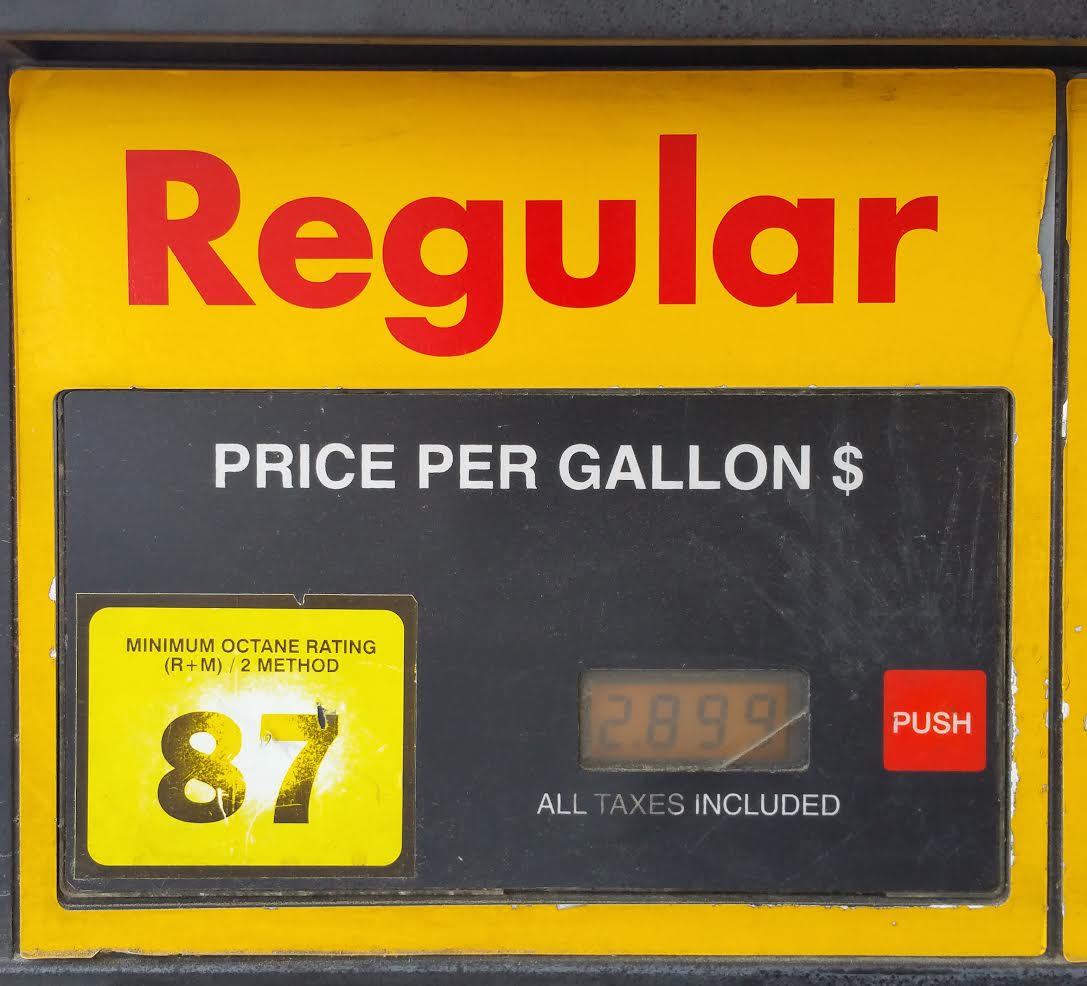
The good: Large, simple graphics make it clear what the options are while the slightly more difficult to read LCD displays let you know what the going (seemingly random) price per-gallon is.

The bad: Some pumps are better at this than others. In this case, the large label with the number tells you the octane level. Since the number defines the choice you’re making, the inclination is to press it. Who could resist that big, yellow target with the number on it?

Except, that’s not what they decided you should press. Instead, just to the right of the LCD is a relatively tiny button which allows you to communicate your choice. That button—which indicates “go” or “proceed”—is set in red of all colors. (Also, a button that contains the word “push” seems a bit redundant and doesn’t specify what pressing it actually does.)

Based on the amount of wear visible on the octane label, it’s clear that other people have tried to do the same thing I did. They made the mistake of thinking that someone thought sufficiently about how to communicate choice.

elegant gas dashboard design at a Shell station

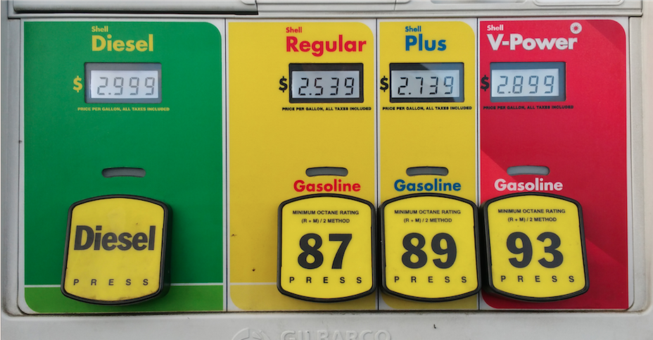
In stark contrast, this pump at a Shell station beautifully combines the octane label with the choice mechanism.

Keep these coming. Send them to us via Twitter or Facebook using the hastag #wtfUX or email them to: [email protected] with “#wtfUX” in the subject line. Include as much context as you can, so we get a full understanding of what the f%*k went wrong. Image of gas pump courtesy Shutterstock.

post authorDaniel Brown

Daniel Brown, Daniel has spent the past 20 years in software companies both large and small. From web design and development for a “boutique” web design firm to Evangelism for Adobe Systems, to helping budding startup companies get a foothold in the market, he’s worn a variety of “hats". Daniel has spoken at a variety of events worldwide including the Sundance Film Festival, Anderson Ranch Arts Center, Santa Fe Digital Workshops, and the Pacific Imaging Center in Hawaii on the topics of web design, digital imaging, photography, and user experience. Daniel currently serves as the head of the interface and user experience department at a small medical software company in Providence, Rhode Island.

Tweet
Share
Post
Share
Email
Print

Related Articles

Navigating the Creative Landscape.

Article by Adri Mukund
Unveiling the Influence of Cognitive Biases on Design Decision-Making
  • The article explores the influence of cognitive biases on design decision-making, outlining various types of biases and offering strategies for mitigating their impact to foster inclusivity and objectivity in design processes.
Share:Unveiling the Influence of Cognitive Biases on Design Decision-Making
6 min read
Article by Chris Kernaghan
Do Founders Even Care About Design?
  • The article emphasizes the importance of design in startup success, highlighting the risks of ignoring user feedback and the necessity of effective communication between founders and designers.
Share:Do Founders Even Care About Design?
6 min read

Designers should not be mere decorators, but understand language and microcopy, which is a crucial design skill, now more than ever.

Article by David Hall
The Essential Guide to Microcopy and Becoming a More Literate Designer
  • The article emphasizes the importance of microcopy in design, highlighting its role in enhancing user experiences and providing guidelines for crafting effective microcopy throughout the design process.
Share:The Essential Guide to Microcopy and Becoming a More Literate Designer
10 min read

Did you know UX Magazine hosts the most popular podcast about conversational AI?

Listen to Invisible Machines

This website uses cookies to ensure you get the best experience on our website. Check our privacy policy and